Hard to believe that it's been about eight years since Osa Johnson's I Married Adventure entered our design consciousness. Obviously there were those who were familiar with the book- and its jazzy cover- long before, but most of us had not a clue about the zebra print book until it started hitting practically every published interior earlier this decade. In a 2001 House & Garden article, designers were polled about books with which they liked to decorate.
Jeffrey Bilhuber mentioned that he had used I Married Adventure in every job. "It's visually exciting, and then there's that title!"

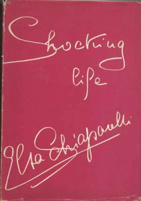
Miles Redd touted the pink impact that Elsa Schiaparelli's Shocking Life had, especially in blue rooms.


Larry Laslo listed not one but three books whose colorful boards rather than dust jackets captivated him. For a dash of red, it's Best of Flair; burgundy is introduced through Horst: Interiors
. And orange? That would be Geoffrey Beene
by Brenda Cullerton.
When asked for his opinion, Albert Hadley said "I hope people have more respect for books. Of course, if you have a pile of them, you do put the best-looking one on top." I think that I have one foot in each camp; I do have a weakness for a great dust jacket, but I also read the book as well. My pick for a book whose cover packs a punch? That would be Great Art Treasures of the Hermitage Museum, St. Petersburg (2 Volume Set). A wee bit expensive, but look at those malachite covers. I first spied the books at my friend Sally's house. The set wasn't even displayed on a cocktail table but rather in the bookshelves, where it still managed to catch my eye...even after two glasses of wine.


(Photo at top House & Garden Nov 2001, Eric Piasecki photographer)

