Orlando Diaz-Azcuy


Sometimes it's easy for the ennui to set in. You know, you see images of interiors and think "Been there, done that". Sometimes, you just want to be shown something new. Well, I found that in Diane Dorrans Saeks' upcoming book Orlando Diaz-Azcuy. Of course, Diaz-Azcuy is not a Johnny come lately. In fact, he has been in the design business for more than forty years. And while I was familiar with his name, I knew nothing about the Cuban born, San Francisco-based designer's work- until now.

I certainly wouldn't call Diaz-Azcuy's look traditional, but there is a luxuriousness to his interiors that appeals to this traditionalist. Some of his interiors are spare, some are edgy. But on the whole, they make me want to step outside of my comfort zone and try a little something new. I think that the rooms that appeal to me most, though, are the richly layered ones. There is one media room that had me swooning. Unfortunately, I can't show the image here, but trust me, it's to die for (think dark green silk walls, gold painted ceiling, and marbleized door frame).

I've long been a fan of Diane's books, so I had high hopes for her newest tome. Fortunately, the book did not disappoint. The author gives the reader great insight into Diaz-Azcuy's design process- both the nuts and bolts and the inspiration too. I love how she described Diaz-Azcuy's work as minimal but with a "touch of va-va-voom". Each chapter focuses on a specific project, including the designer's own homes, and there is also an interesting section titled "Talking Design", a conversation between the author and the designer. And the icing on the cake? Diaz-Azcuy has included a brief list of books that have inspired him. Beautiful images, a story well-written, AND a book list? What more could you ask for?

(Diane Dorrans Saeks is currently at work on her upcoming blog,
The Style Saloniste. Look for the official debut in the next few weeks. I'm confident that not only will it be well-written (would you expect anything less?), but supremely stylish as well!)


This tableau seems quite poetic. In fact, it's Diaz-Azcuy's Pacific Heights penthouse. (© David Duncan Livingston, reprinted from Orlando Diaz-Azcuy by Diane Dorrans Saeks, Rizzoli New York, 2009)


A closet cum media room. Definitely va-va-voom. (© Tim Street-Porter, reprinted from Orlando Diaz-Azcuy by Diane Dorrans Saeks, Rizzoli New York, 2009)


The lush outdoor terrace of one of Diaz-Azcuy's homes. (© Matthew Millman, reprinted from Orlando Diaz-Azcuy by Diane Dorrans Saeks, Rizzoli New York, 2009)

Image at top of Orlando Diaz-Azcuy, © Tim Street-Porter, reprinted from Orlando Diaz-Azcuy by Diane Dorrans Saeks, Rizzoli New York, 2009.

Polyvore Living Room

Dreamy French Vanilla by Marley&Lockyer on Polyvore.com

Dreamy French Vanilla

I have been playing around on Polyvore tonight to put this Sofa in a setting...I just adore it and it is SO me! So are all the other pieces that make up the space. The colour in the background is what I am off to get tomorrow to paint our Living/ Kitchen /dining space...Murobond 'Stone'. It is the perfect linen shade (I took a piece with me to have it matched). I still have to add a rug to this setting and some curtains...I am thinking Aubusson rug and linen drapes with black wrought iron rod.
Anyway, check out the link and leave me a comment on what you think.
Ness xx

Raymond Loewy and His Theory of Evolution


Industrial design is not one of my areas of expertise. But even if you're like me, you've probably heard of the name Raymond Loewy. Loewy was considered to be one of the most prominent industrial designers ever. In fact, I'm sure you've seen many of his designs: the Lucky Strike cigarette logo and package; the Greyhound bus and logo; and numerous refrigerators, ranges, and cars. He was also responsible for the design of numerous retail and commercial interiors, including this bake shop (at top). The man was truly prolific.

Loewy was a major proponent of streamlined design (as is evidenced by the bake shop and his iconic pencil sharpener, seen below, from 1934). So much so, in fact, that in the early 1930s Loewy created a series of evolution charts which showed how everyday objects had become more streamlined through the years. I hate to describe these charts as charming because it's a fluffy word to use in association with industrial design. Still, I did find these charts charming. In this era of everything being supersized, streamlined design is a breath of fresh air.


Loewy's famous pencil sharpener.


The evolution of chairs. Loewy would have been dismayed, I believe, to see those grossly oversized upholstered chairs and sofas that have been popular over the last twenty years.


The evolution of clocks. I still have a weakness for streamlined clocks.


The bathing suit. The big question mark? I suppose that ended up being the thong bikini!


The automobile.


The telephone. Just look at how streamlined our cell phones are.


Women's clothing. Thank goodness for streamlining here. That atrocity of 1980s fashion- the pouf skirt- was simply a hiccup along the way.


Stemware. Nothing beats a sleek champagne flute.

(All images from Depression Modern: The Thirties Style in America.)

Thank you!

I had a lovely Birthday yesterday and I thank you all for your wishes.
Present wise I was given from Mic and the boys, Paul Bangay's Complete Garden Handbook (as you know we are trying to create a garden) and some new Sable Artist brushes. I made it quite hard for him this year, as I didn't really want or need anything, so I was very happy with these.
From Mic's Family, beauty products, Pilate's DVD, Somethings Gotta Give Soundtrack (which I have listened to all day). I also got some English box hedges and Pittosporum screening hedges en mass for our garden. A few things will be arriving this weekend as well when my Mum flies in to stay for 2 weeks...yay! Oh and I bought myself some things too, so I done really well considering I made it hard for everyone!!
The cheesecake went down well..but then I felt a little ill...maybe guilty, not sure.
Ness xx

I Want Everything In This Room!


I can't stop looking at this photo of antiques dealer Louis Bofferding's (former?) Manhattan living room that was featured in the 1996 book The Table. One reason of course is because the room is just so good looking- clean, uncluttered, airy, masculine, restrained, and immensely chic. What I also like about it is that there isn't a shred of mediocrity in this room. Each piece is magnificent on its own, but when mixed with other important pieces? Decorative Arts Heaven! Would you expect anything less from such an admired dealer?

When you start to dissect the room and study each piece, it's hard not to be impressed by the provenances. A 1950s Jansen table with blue steel legs. Fornasetti faux malachite plates. An iron elephant mounted on a red silk pedestal from Geoffrey Bennison (on table). A Louis XVI armchair with antique Chanel purple silk velvet. And barely visible in the far left hand corner, an iconic "Bird Table" by Meret Oppenheim, c. 1939. Yep, I swooned too. But rather than seeming ostentatious or even "full of it", the room- gold chip furniture and all- comes across as personal and well-thought out. It is truly the room of an erudite man who really knows his stuff!


This Royal Dining Table by Maison Jansen looks similar to that of Bofferding except for the legs which are black steel rather than blue. (Available at Todd Merrill Antiques)


Gold leafed Bird Table by Meret Oppenheim, available at Eccola. The listing on 1st dibs says this specific table is 21st century, so obviously this table is a much later version than that of Bofferding.


Bofferding's table was set with these Fornasetti plates. Also, you can get a better look at the Bennison piece.


A pair of Fornasetti gold and malachite plates, available at Gallery 25.


The pineapple on Bofferding's console appears to be tole. This pair of lamps from John Salibello Antiques have a similar look.

(Images of Bofferding's apartment from The Table, Diane von Furstenberg)

Yay! Its My Birthday...

Well today is my 33rd Birthday!! - I know some of you thought it was last week. We had a rather extended celebration this year. I am just doing a quick post tonight as our Family is about to arrive for presents, cake etc. I will tell you all tomorrow what I was given. I am so excited to be having some luscious cheesecake for a cake.
I haven't had anything naughty for about 6 weeks now as I have been trying to shed some weight...(6 1/2" from my waist so far). I just hope it tastes good!
I will let you all know what I received tomorrow.
Ness xx

Hall of Mirrors


And it's not the one at Versailles. Those clever guys at Downtown- David, Robert, Onik, and Carlos- as well as Elizabeth Dinkel and Kim Alexandriuk created a fabulous entrance hall (see above) at the recent Los Angeles Antiques Show. The array of mirrors included examples of Art Deco, Modernism, and French 20th century. Note too the trompe l'oeil painted walls. Wouldn't this be great to do at home in a hallway, an entry hall, or even on an outdoor terrace?


Downtown's booth included pieces by Arturo Pani, Jay Spectre, Line Vautrine, and Mito Block. David and Robert are always on the cusp of the next hot thing, so it's no wonder that everyone pays attention to what they display.

At Home with William Powell


One of my favorite actors from the old days is William Powell. He could be suave and debonair, had a way with the witty repartee and the ladies, and displayed a wicked sense of humor, all the while being downright likable. I always thought it would have been fun to play Nora to his Nick Charles. And since he was a star during Hollywood's Golden Era, you wouldn't expect his home to have been anything less than glamorous. His Beverly Hills manse, featured in the February 1936 issue of House & Garden, was designed by architect J.F. Dolena and decorated by that decorator to the stars Billy Haines. Whether Powell played an active role in the design of his home is anybody's guess, but I suppose that doesn't really matter as he at least had the good sense to live in a Dolena house. While the interior looks a little dated, I think the architecture of the home- Regency inspired- was divine and completely befitting a Hollywood star of Powell's caliber.


Powell's terrace with intricate wrought iron detail.


The courtyard with a bay window that was really a two-way bar. How great is that? I also love those metal patio chairs.


The pool house. Fabulous metal canopy above the door.


The recreation room decorated by Haines. The walls were knotty pine, the curtains were blue cashmere, and the fabric on the furniture ranged from blue and white plaid to blue, green, red, and white striped. Hmmm. What I do like, though, is the fireplace to the right with blue and white delft tiles.

(All images from House & Garden, Feb. 1936)

Newbie and my Lamp...

I actually had a really lovely and productive weekend as we were rained in....torrential rain! We had a birthday dinner with the family on Saturday night (cooked by Mic..sort of), watched movies and I got lots of new items made for The Shop.Like this new cover. I really like this one as the sign is from a little Village in Britain and it is something different from the Bus sign covers. You can buy these new covers HERE!
I also realised I forgot to post about my lamp makeover from my office re-do, so...
This is it before. A bit bland, but has potential...(this photo was taken during the office change, so excuse the mess)

A tube of acrylic in Neutral Grey, paintbrush, piece of linen and were away. I just used the brush to work the paint into all of the grooves, then rubbed most of it off with the linen.
...it really showed the features up well. At this stage you can work some more paint into it if you want it a little darker, or maybe add a high light colour like silver or black....
I love how it looks like an old Architectural column...

This is it after and on my new desk. It throws off a lovely warm light and looks great with my white Geraniums. you can do this finish with terracotta pots, picture frames and anything that has a raised pattern to it. Whatever you try it on will look like a new piece.
Have fun!
Ness xx

Garden Style ... creeping fig ...

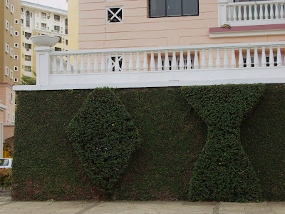
There is something very alluring to me ... about the creeping fig ... I love the way it so completely covers up walls ... and lo ... you have a beautiful greenscape...

In our complex ... here in Navi Mumbai , we have creeping fig grown as art work ... beautiful living green canvas ... and I just can't help but feel sooooo nice .... just walking past these amazing stone walls ... all covered in green...

The gardener ... was first given this design concept by one of the estate managers ... (I haven't been able to find out any more about how it all started) ... and over years ... all the stone walls have been covered by the creeper...
Shivaji , one of the gardeners here (and theres a whole army of them) ... is absolutely clear ,that he alone has the artistic capabilities to craft these masterpieces :) ... oh! I love gardeners with this kind of passion for work ...

Like all artists,Shivaji loves to be indulged in a conversation about his work ... how he keeps the base creeper shaved close to the wall and allows the rest to grow out and that is when the gardener steps in and gives it the so many interesting shapes you see in these pictures :) ... The creeper was just about climbing the white borders ... and I could already see the gardeners ... on the move to do the maintenance work and cut it back ...that is the thing with creeping fig ... its beautiful ... but you need to maintain it ... within certain limits ... or else it'll run completely amuck ...


Enjoying the creeping fig... you don't need a huge wall ...or a large space ... they make great topiaries ... they 'll give an amazing tropical feel in your balcony... let them cover your walls ... make sure you don't let it run out ... they creep out before you know :)


On our regular walks ... my girls Sarah ( who was sleeping while we took this walk) and Aimee (the one checking out the walls here) and I have a wonderful time ...
... theres always something different and exciting around these walls ... they seem alive in some way ... not just dead stone walls ... not that I don't love stone walls ... I think I just love stone walls more when covered in greens ... :) 
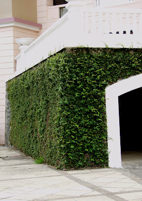
... and there ... you'd never know ... there's a matter-of-factly,car park behind those walls ...

Another ,element in garden design ... if you are inspired,by this green scape ... do write in to me ... I'd love to hear your story ...

Blog Archive